Choosing the Right Diagrams to Synchronize Teams
There are many types of documentation, so make sure you choose wisely.
Role:
Founding Product Designer
Type:
Web
Length:
4 months


In early 2017, Netflix approached my agency for help in redesigning their brand partner portal. Brand partners are companies who want to use the Netflix brand in their messaging, packaging, or promotional materials. A simple example would be Samsung, who might want to advertise the fact that their smart TVs feature the Netflix app.
While the existing portal was functional, it posed significant challenges: updating content was cumbersome, the process for translating and approving asssets was fragile, and the Partnership team was overwhelmed with invalid approval submissions. Netflix needed an overhaul that streamlined content management, translations, approvals, and improved the user experience for partners.
As UX Lead, I took ownership of the user experience from concept to launch. I participated in the initial pitch, facilitated design workshops, conducted stakeholder and user interviews, and collaborated closely with creative and technical leads across both the agency and Netflix. My responsibilities spanned the entire product lifecycle, from research and strategy to design, QA, and final production.
Goal: Simplify the process for partners to understand and access branding resources, reducing rejected submissions due to overlooked guidelines.
We began with a full-day workshop, gathering key stakeholders to define project goals, identify user groups, and outline the various ways companies could partner with Netflix. This helped us gain a shared understanding of the processes, content flows, and partner needs.
I then conducted interviews with stakeholders and partners, mapping out the steps, tools, and challenges involved in managing partner relationships. The primary issue for Netflix was overhead: too many spurious approval requests because partners missed key instructions. For new partners, the main problem was that the process and their status within it was unclear.
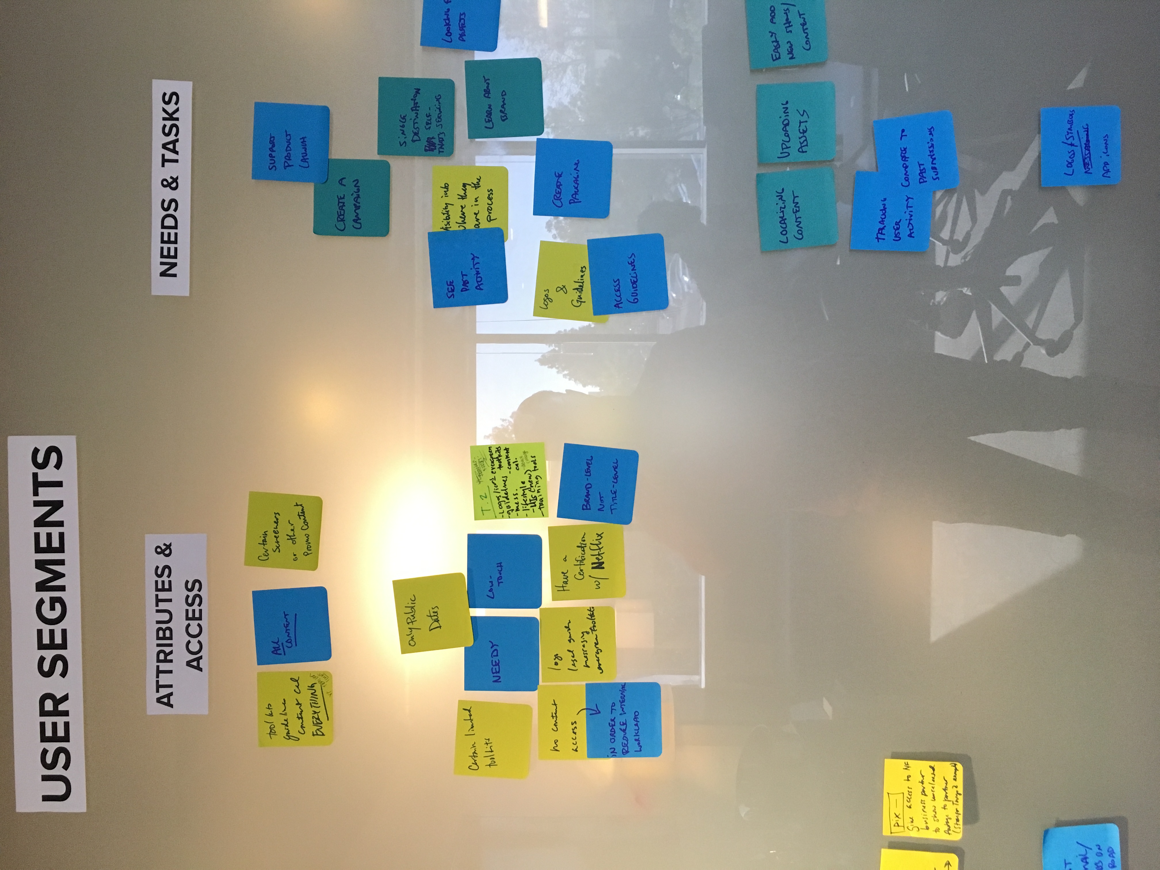
I took all the findings from the interviews and combined them to create a service blueprint that documented and annotated all the parts of the intended service. Reviewing this with the team at Netflix, they realized that there were a few missing details. Once I added them, we were ready to move on to the next phase.

Goal: Create a content structure that accommodated diverse needs across multiple stakeholder groups while ensuring clarity and scalability.
This was challenging not because different user types needed access to different kinds of content, but because some of the content "buckets" had the same name, but different assets and guidelines. In order to keep them distinguishable for Netflix employees, we had to carefully name the content groups.
Through rapid iterations—from whiteboard sketches to wireframes—I worked alongside the Art Director to catalog and structure the content for the site. I created a series of sitemaps, one per user type, outlining the content experience for each. After reviewing with the client, we developed a modular, scalable template system that enabled easy updates and future expansion.


Goal: Improve the process for translating guidelines and content into multiple languages, making it easier for Netflix to keep their portal updated globally.
We were already building a content management system (CMS) for English content management, and Netflix had an automated translation system in progress. The key challenge was integrating these systems and defining the level of control needed within the CMS for managing translations.
I suggested visualizing the process using state transition diagrams, adapted from my object-oriented programming background, to map out the potential states of translated pages and the interactions between them. This visualization made it easier for the team to understand how content would flow between states and handle errors.
The diagrams provided clarity, enabling us to quickly reach agreement on feature requirements and interactions. We integrated a seamless translation workflow within the CMS, making it easier for Netflix to manage multilingual content.


